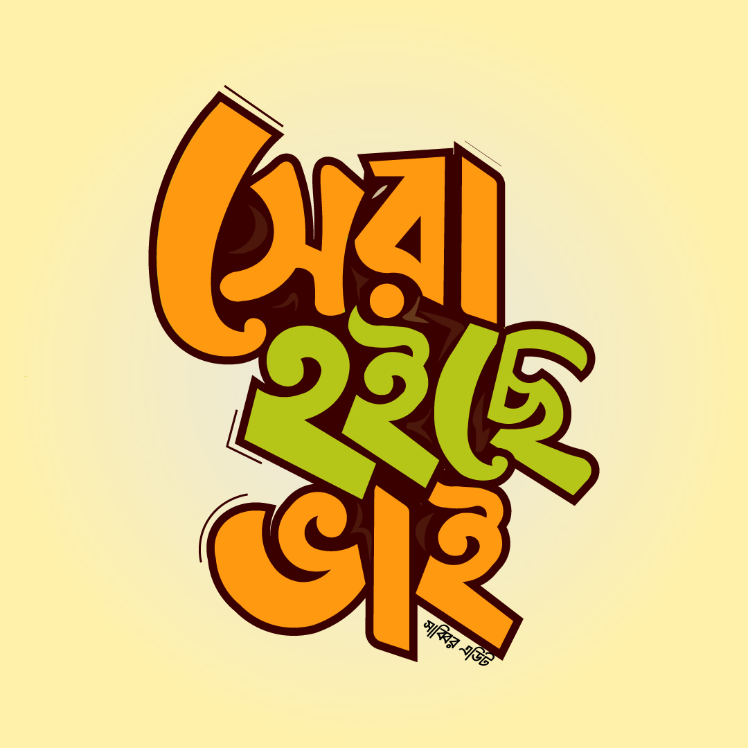
"Sera Hoiche Bhai" Custom typography seen.
Project Overview
🎨 Typography Concept: "Sera Hoiche Bhai"
The centerpiece of this design is inspired by the bold, custom typography seen in the "Sera Hoiche Bhai" (It’s the Best, Brother) artwork. By using stylized, thick-stroked lettering, the poster ensures that key messages—like "Admissions Open"—stand out with a professional and trustworthy flair.
🛠 Key Design Elements:
Clean Hierarchy: Information regarding class levels, academic sessions, and contact details is organized for maximum readability.
Color Harmony: A balanced palette of warm oranges and earthy greens provides a vibrant yet respectful tone, suitable for educational branding.
Modern Branding: Moving away from cluttered designs, this poster uses white space and sharp vector elements to maintain a "Clean & Professional" look.
Versatility: Optimized for high-quality printing (banners/flyers) and digital sharing on social media platforms.
The design is specifically tailored for Bold Typography.